Information evolution

[wlm_nonmember]
News stories are free to read. Click here for full access to all the features, articles and archive from only £8.99.
[/wlm_nonmember]
A Ribble poster from the 1950s, drawing people’s attention to the destination, not the journey. Note the blank space for a fare, allowing the same posters to be used in different locations. MoTGM COLLECTION

Jonathan Welch takes a brief look through the huge archive of publicity material held by the Museum of Transport Greater Manchester

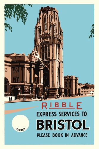
We’ve all seen those famous railways posters of a different era, haven’t we? The ones that depict the luxury or elegance of travel, the beauty of the destination or the power of the engine. The distinct style has made sure they remain popular as art so many years, decades even, after they were on display.

But what about the bus industry? I was recently given the privilege of a guided tour of some of the behind the scenes areas of the Museum of Transport, Greater Manchester, where the museum’s Paul Williams showed me some of the usually-hidden archive of publicity. The store room contains everything from art-deco posters to FirstGroup corporate timetable booklets, and from fearsome-looking fare charts to humble cove panel adverts.

It raised a number of questions, including whether the industry is truly better at promoting itself these days, or whether it’s just got more technology to do it with, regardless of quality. There are some great examples from the past, and some terrible examples from now. And vice versa of course. The past isn’t always that wonderful place that nostalgia remembers it to be.

A stern warning against fare evasion for Manchester passengers. MoTGM COLLECTION

Communicating well

“When it comes to publicity from any era,” Paul said as he leafed through a drawer of historic posters, “there is the good, the bad and the ugly. It’s easy to say ‘let’s look at the good ones’ and forget about what we can learn from the bad ones. We have in our collection some horrific examples of information transfer – or lack of it.”

[wlm_nonmember][…]

Are you enjoying this feature? Why not subscribe to continue reading?

Subscribe for 6 issues/weeks from only £6Or login if you are already a subscriber

By subscribing you will benefit from:

  • Operator & Supplier Profiles
  • Face-to-Face Interviews
  • Lastest News
  • Test Drives and Reviews
  • Legal Updates
  • Route Focus
  • Industry Insider Opinions
  • Passenger Perspective
  • Vehicle Launches
  • and much more!
[/wlm_nonmember][wlm_ismember]

A career in corporate communications has taught Paul the value of being able to get the message across well. “It’s interesting to look at the unsung heroes,” he added. “The posters in the windows, the fare information, the everyday ones that are easily overlooked, and see how they have developed.

“We have some examples that are very wordy. Can you imagine people standing and reading the smallprint on some of these,” he asked.

Even some of the modern examples from the 1990s and 2000s, despite their glossy finish and colour printing, are far from what we might consider today as being prime examples of the industry’s ‘shop window’ – although some of the 2000s-era timetable leaflets reminded me that I’d always thought First’s ‘Overground’/’Metro’ concept was a good one with its clear, simple and easy to understand coloured route branding and matching publicity.

We contrasted this with an example from the 1930s, and on the face of it, it’s a dauntingly large sheet of numbers and names, in this case for Manchester Corporation’s service number 1. Maybe looking at it through the eyes of a 1930s passenger, though, it’s not so daunting. It’s from a time when people knew how to read such things – or at least, we’d like to be able to assume they could, given that public transport use was so much more common. My own experience as a driver has shown that an alarming number of people seem to have difficulties understanding a printed list of times at a bus stop; a sign of the times, or have we just forgotten that those people existed long ago too?

It’s 1987 and orange is the colour of choice for Manchester’s transport network. MoTGM COLLECTION

Friendly or formal

One thing that has changed is the use of language. The wordy and formal text of the past has gone, the rise of colour printing and the need to encourage passengers on board after deregulation helping to drive publicity towards a more accessible, friendly format.

Talking about how the trends and styles have developed, Paul explained that there has been a gradual trend away from ‘you must’ which treats the passenger as a subordinate, a servant of the company, to a view which has the passenger at the top. ‘We’d like you to’ or ‘we’d like to tell you’ are now the order of the day, though some might argue that a more forceful tone ought still to be used in certain circumstances.

Considering how the trends for more friendly, accessible formats developed, Paul explained: “Frank Pick created the idea of a homogeneous brand identity in London, but the rest of the industry took decades to catch up. But good publicity isn’t just about London. We have some great examples in our collection from across the country,” he said showing me some North Western posters advertising express services to the Cambrian coast and ones from Ribble for its expresses to Bristol, as well as more local examples from Greater Manchester Transport (GMT).

Frank Pick was a man who left quite a mark on transport, especially in London, in his 30-year career, changing the face of London Transport, and indeed of London transport. His strong belief in ‘fitness for purpose’ drove a lot of his work and his ethos to enhance the quality of the passenger environment. He was known for his attention to detail and innovation, and cultivated a network of artists and designers, and left a legacy unlike almost any other when it comes to transport design.

It was Pick who led the way with the move from posters as a text-based medium to something more eye-catching, and who spearheaded the idea of focusing attention on the destination rather than the journey. A clearer typeface for London’s transport network was also a result of his thinking, further taking posters away from the clunky print used before; all features which can be seen across Britain’s transport networks in the subsequent decades.

And whilst some of the artwork from operators nationwide is remembered and preserved, Paul raised another important issue, that of ‘corporate memory.’ “Our message to the industry is that corporate memory is easy to lose,” Paul said. “Information needs are pretty consistent over time – make a clear signal for the bus to stop, tender the right money, be aware of timetable changes.

“It’s too easy to lose or forget, especially when there’s a large turnover of staff. People leave and things are forgotten and lost, or thrown away as ‘junk.’ So it’s always worth looking what your company (or its predecessor) did 30, 40 or 50 years ago to help get the same basic message across.”

Definitely of its time is this job advert from SELNEC. MoTGM COLLECTION

Pace of progress

Opening another drawer, we found some very wordy cove panel advertisements and SELNEC publicity material, and noted how wordy and formal it was compared to successor GMT’s posters of the following decade. “The newer ones are clearer, bolder, and easier to digest,” Paul pointed out. “You don’t need to spend 10 minutes reading it to digest it.”

In more recent years, we’ve seen a move to digital, which has quickened the speed of access to information even more. But it’s also less tactile, less tangible, and probably also easier to ‘throw away’ – something operators and archivists should be aware of.

Talking about publicity in the modern era, and how expectations have changed, David Jordan, former First Eastern Counties Senior Marketing Manager and founder of speciality transport design agency Jump-On said: “The need for high quality publicity, presented in an attractive, simple and attractive style, acting as an operator’s shop window, is as important today as it has ever been, even when taking into account the multitude of journey planning apps and websites that are available, with their varying degrees of usefulness in the information they supply.

“Live sources such as these are of enormous value in providing real-time bus tracking but it is hard to envisage a time when they will ever fully replace truly tangible information, whether this is in printed form, or by the means of an online or PDF timetable. For any such timetable to truly be of use to intending passengers, especially those who come into the holy grail-like category of new users, there is a clear need for the information presented to have been professionally interpreted or simplified from a customer-centric perspective, rather than being presented as largely unrefined data from either scheduling software or a TransXchange file. Sadly, the latter option is often the route taken, one would presume as a questionably identified cost-saving measure on what is arguably the most valuable piece in the vast publicity jigsaw that intertwines all aspects of the industry.”

How many current transport users would even look at something like this 1930s fare chart, let along understand it? MoTGM COLLECTION

Contextual detail

“Moreover,” David continued, “professionally-produced timetables allow the inclusion of other important details. These would usually include a suitably route-centric map with an appropriate level of contextual geographic information included, such as landmarks or unserved roads, aimed at providing wayfinding assistance for the potential passenger, whilst cutting out the ‘noise’ of, say, a route simply overlaid on a digital roadmap.

“Alongside some basic fares and ticketing information (arguably less valuable in the era of the £2 single fare), a printed (or PDF) timetable also communicates a concrete intent that a service will operate in a way that digital information does not. It can also be used to promote served destinations in such a way as to inspire travel, and at a time when the reader’s thoughts are likely already subconsciously in tune with the possibilities being presented to them.

“The clear difference between publicity and marketing is also something that must be properly appreciated in order to attract new users, alongside a realisation that the two are intrinsically linked and must work together to achieve maximum benefit. Marketing (i.e. getting the word out about a particular service, ticket, or benefit of bus travel) whether in digital or printed form is now far more measurable than ever, with the ability to target all forms of digital advertising at those most likely to respond positively to it and then measure its success in a way that a poster, however attractively designed, in a bus station or on board a bus, could never achieve.

“On that basis, marketing is rightly regarded as an investment that, under the right conditions, will generate passengers and revenue. However, this must always be underpinned by a firm foundation of publicity (often incorrectly regarded purely as a non-generative cost) that allows those who have been persuaded to make a journey to do so easily, and with minimum effort required or the money spent on attracting potential new users is simply wasted.”

As technology evolves, it’s interesting to look back at where we’ve come from, how information provision has developed, and wonder what the future might hold.

​motgm.uk

jump-on.co.uk

The modern way

This modern example is the inside of a door drop leaflet designed by David Jordan at Jump-On, and delivered to all homes in Thetford a week before Coach Services’ new Breckland Beeline service to Norwich began. David explains that it sought to provide, in a simple and engaging style, all the information a potential passenger from the town would need to use the service – essentially where does it go, when does it go, how much is it and why should I use it – all covered in both visual and written form.

The timetable information included was cut down and displayed in such a way as to only show the core Thetford to Norwich service, cutting out all other stops (there aren’t many, David adds) and turning the timetable on its head to be read in the style of a book from left to right, which he says research has shown to be more accessible to those unfamiliar with timetables.

Three months on from the introduction of the service, which is operated without any BSIP or other local authority support, David reports that the timetable is about to be increased as a result of passenger loadings which were strong from day one, partially as a result of using the most appropriate and cost-effective forms of digital and print marketing built on the foundations of solid publicity to allow people to make use of the new service with ease.

[/wlm_ismember]